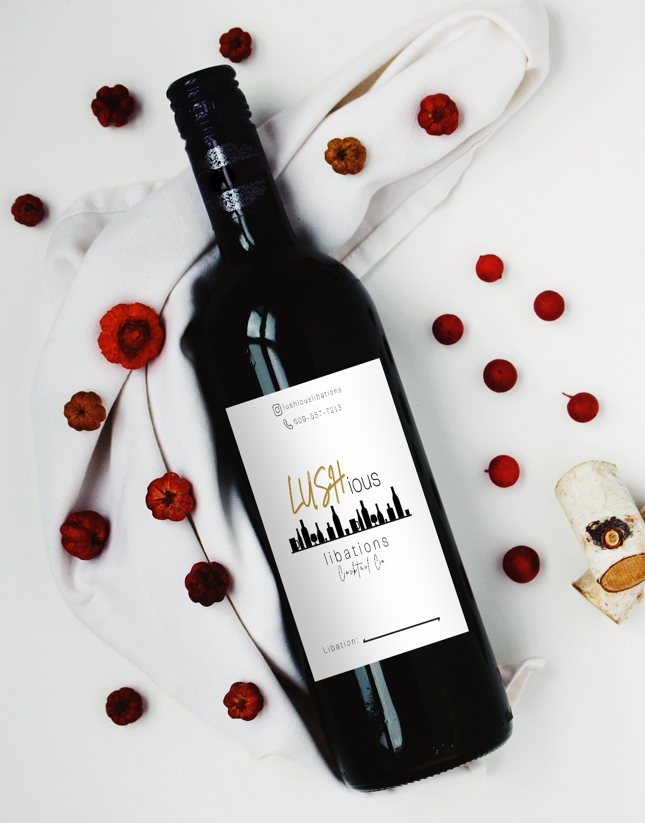
About this Project
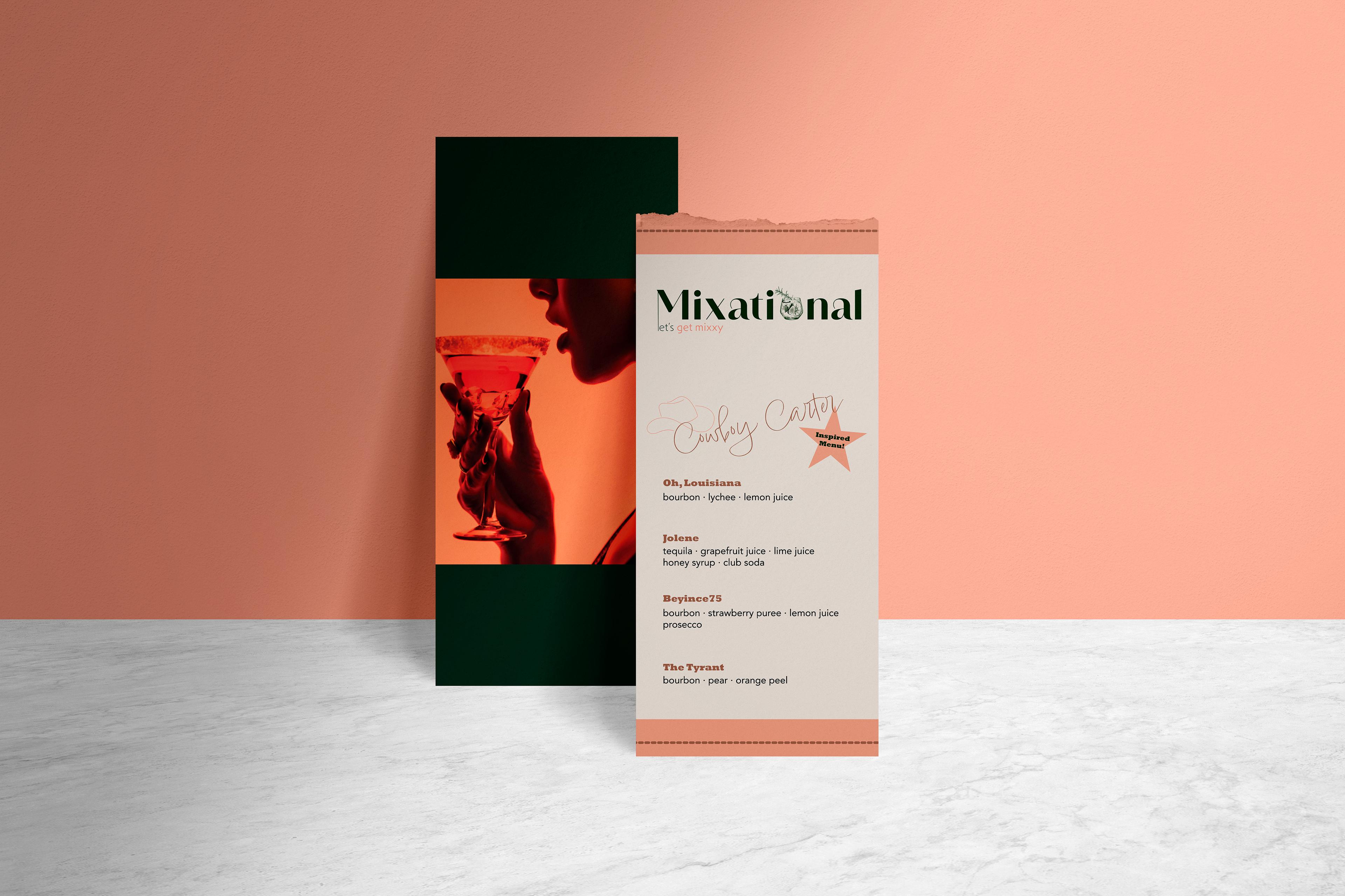
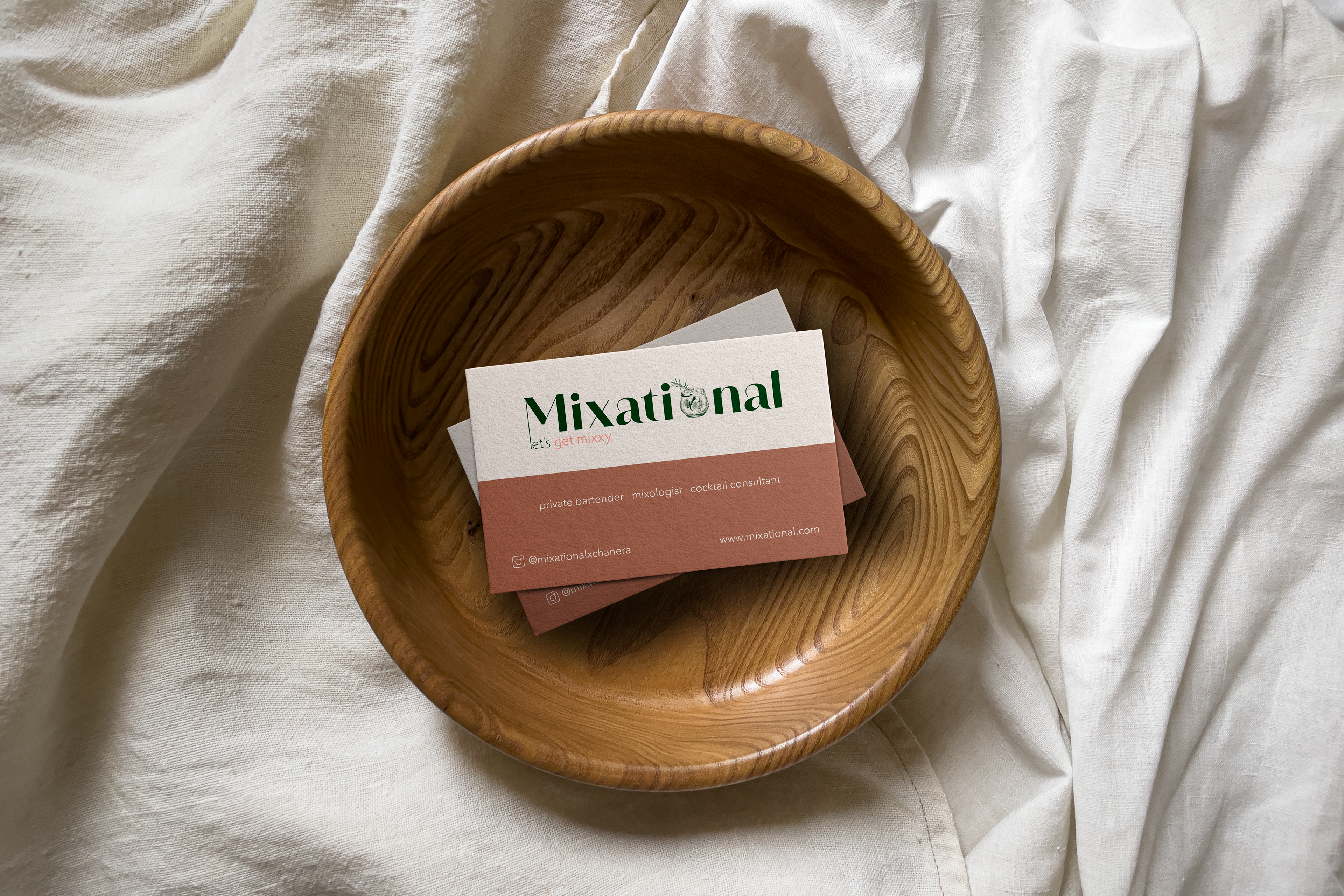
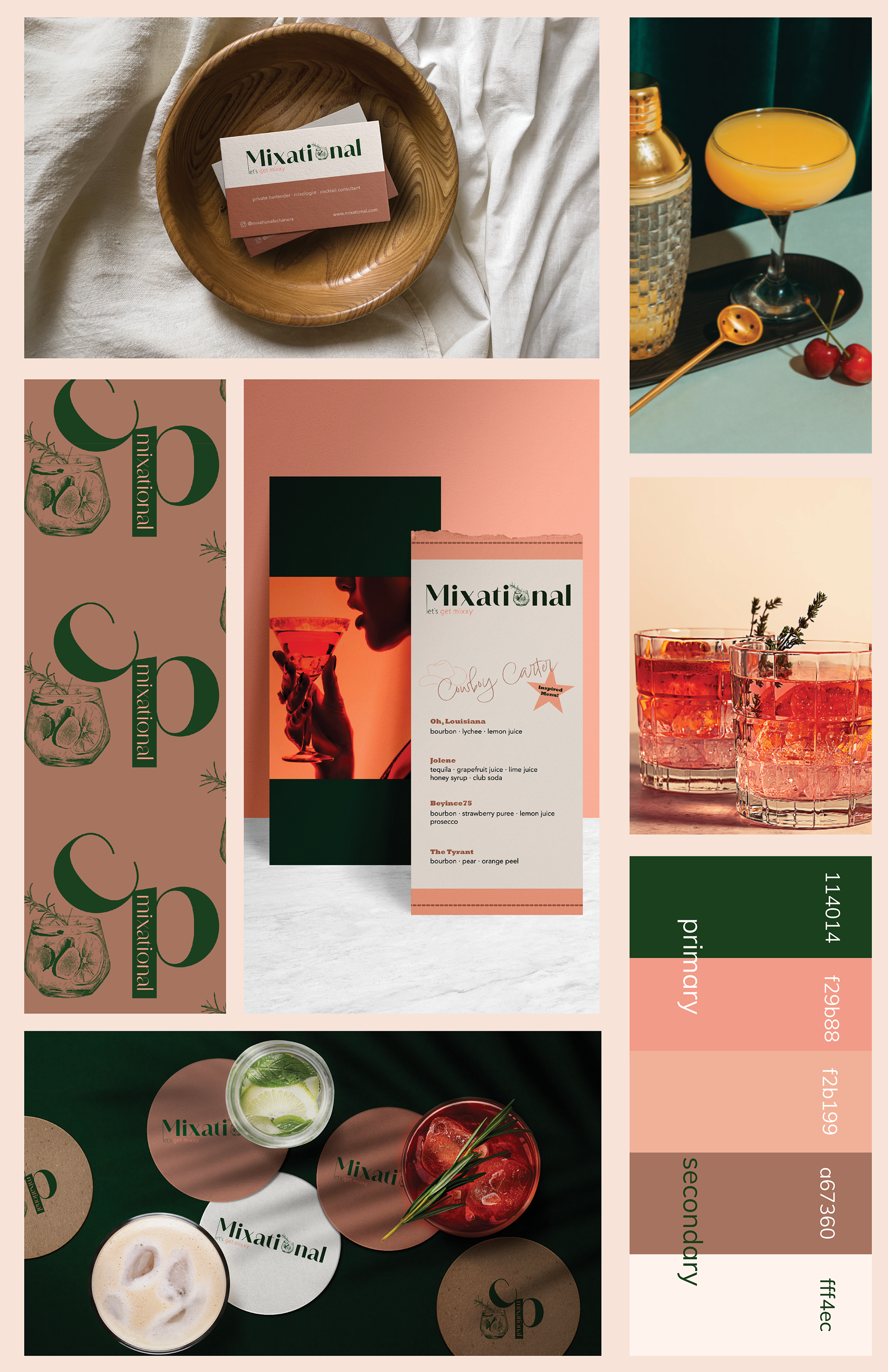
The client approached me for a modern logo design to represent their mixology business. They had initially created a logo and vision board using Canva, incorporating a color palette of soft pinks, greens, ivory, gold, and lavender to evoke a feminine and delicate aesthetic.
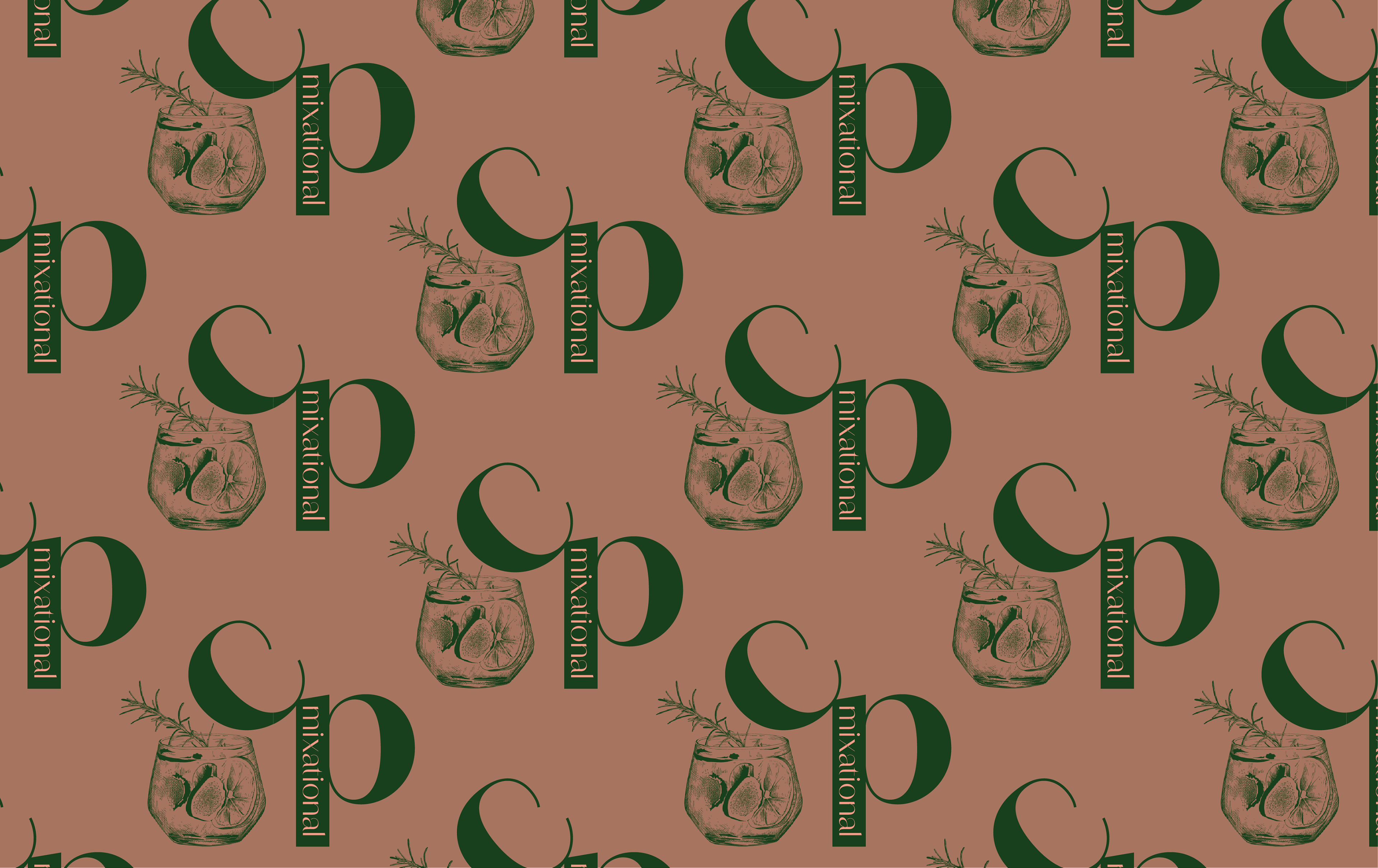
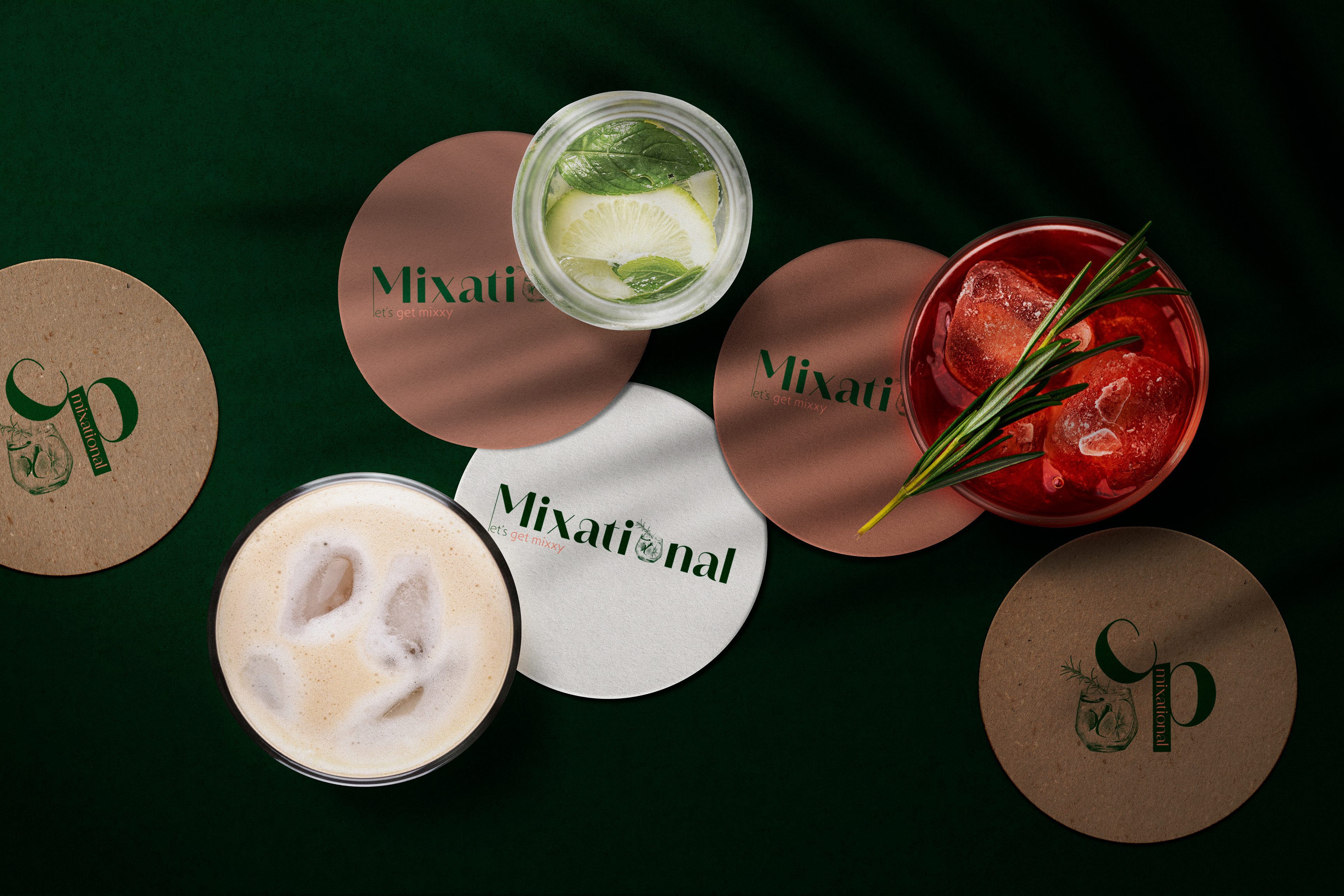
After reviewing their social media presence, I noticed their emphasis on high-quality ingredients and custom cocktails. I realized their existing color palette didn’t fully convey the sophistication and luxury of their offerings. To better align their branding, I selected a deep green as the primary color, symbolizing abundance and luxury, and refined the palette accordingly.
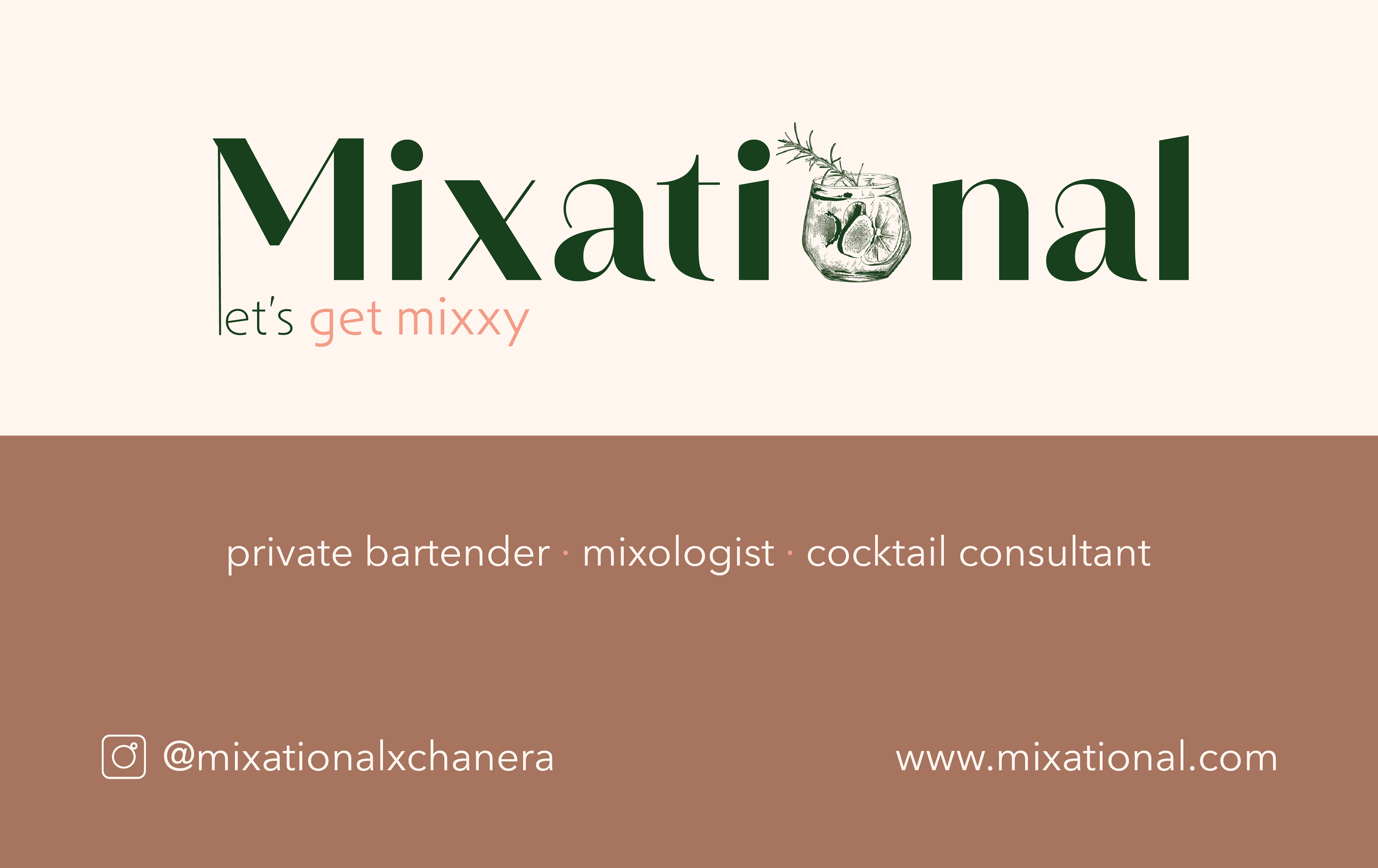
For the logo, I experimented with bold yet refined typefaces to ensure legibility and elegance. To reflect the mixology theme, I creatively incorporated a cocktail glass into the design, using it to represent the letter “O.” The result was a sleek, memorable logo that embodied the sophistication of their brand.
Logo Design
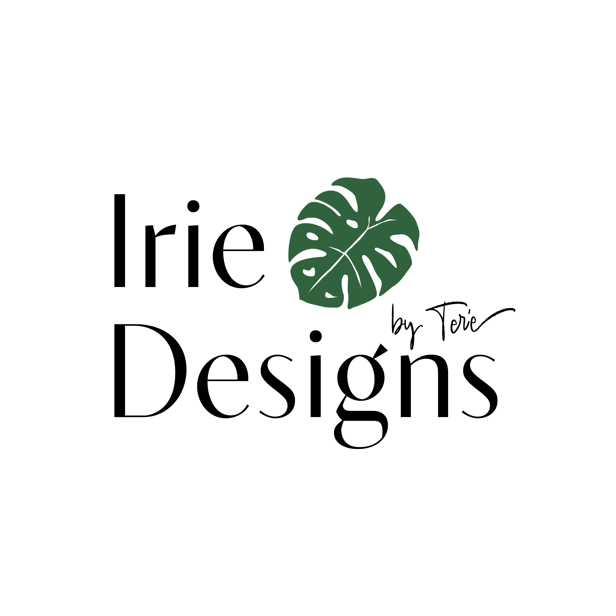
Here is a selection of my favorite logos that I have designed over the years.